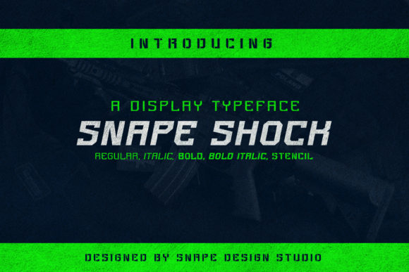
Snape Shock: A Display Font That Commands Attention
First glance at Snape Shock isn’t subtle—it’s a jolt. Not chaotic, not gimmicky, but deliberately charged: sharp terminals, tight counters, and a rhythm that leans forward like it’s about to speak. This isn’t a font that waits for permission. It’s a display font with attitude—confident, slightly theatrical, and unapologetically bold. Think of it as the typographic equivalent of a well-tailored blazer worn over a band T-shirt: polished structure meets raw energy. It doesn’t whisper brand values—it declares them.
Snape Shock lands somewhere between modern typography and expressive editorial design. The uppercase letters have presence—clean geometry with just enough idiosyncrasy in the ‘S’, ‘K’, and ‘R’ to avoid sterility. Lowercase is less prominent (and intentionally so); this isn’t a workhorse text face. Its strength lives in short bursts: a logo lockup, a poster headline, a product label screaming “limited edition,” or a social media graphic demanding a pause mid-scroll.
In real project use, Snape Shock shines where impact trumps endurance. For logo design, it works brilliantly when the brand voice is bold, contemporary, and audience-aware—think indie beauty brands, vinyl record labels, boutique fitness studios, or craft beverage packaging. It holds up beautifully on matte black soap boxes, foil-stamped tote bags, and neon-lit café signage. On screen, it anchors hero sections on landing pages and dominates Instagram story headers—especially when paired with generous negative space and restrained color palettes.
It’s equally effective in packaging design and product labels, particularly for small-batch or premium goods. A jar of small-batch hot sauce? Yes. A ceramic mug line with irreverent slogans? Absolutely. But don’t reach for Snape Shock when you need legibility at 8pt on a nutrition panel—or for body copy in a long-form blog post. That’s not its job. It’s a creative font, not a utility font.
Where does it falter? In extended reading. In dense layouts. In contexts demanding neutrality or tradition. You wouldn’t use Snape Shock for a law firm’s annual report or a university course syllabus—and that’s by design. Its personality is too vivid for those roles. It also demands thoughtful font pairing. Next to a delicate script font, it can overwhelm. Next to a heavy serif font, it risks visual competition. But set it beside a clean, open sans serif (like Inter or Poppins) or a grounded, low-contrast serif (think Lora or Merriweather), and it gains contrast, clarity, and sophistication.
For editorial design, think chapter openers—not body text. For social media graphics, it excels in quote cards, launch announcements, and campaign headers—especially when used in all caps with tight tracking. In printable design like wedding invitations or event posters, it adds memorability without sacrificing elegance—provided spacing is adjusted manually. And yes, it translates well to Cricut projects and Canva templates, but only if your end users understand its scale limitations: it’s not forgiving at sub-24pt sizes on physical substrates.
Readability isn’t Snape Shock’s primary goal—but that doesn’t mean it sacrifices clarity. At headline sizes (36pt and up), its letterforms are distinct, balanced, and highly scannable. Tracking matters: default spacing often needs tightening for logos and short phrases, loosening slightly for longer display lines. Kerning pairs like ‘AV’, ‘To’, and ‘Wa’ benefit from manual attention. And always test it in black and white first—its contrast and weight hold up impressively without color crutches.
Brand consistency takes intention with Snape Shock. Because it’s so expressive, overuse dilutes its power. Reserve it for primary marks and high-impact moments. Let supporting typefaces handle navigation, captions, and descriptions. That contrast builds hierarchy—and trust. Audiences sense when a brand knows *how* to wield strong typography versus when it’s just shouting. Snape Shock earns credibility when used with restraint and purpose.
Engagement spikes when Snape Shock appears in unexpected but appropriate places: a single word on a minimalist email header, a punchy CTA button in a digital ad, or the title treatment on a podcast cover. Its visual mood—energetic, confident, slightly rebellious—resonates with audiences who value authenticity over polish. Just be sure the tone aligns: a playful skincare brand? Perfect. A heritage financial service? Reconsider.
Here’s what I do before committing Snape Shock to client work:
- Test it on real mockups—not just screens. Print a business card, stick it on a product sample, hold it under store lighting.
- Check small-size readability: 18pt on a mobile banner, 24pt on a sticker, 30pt on a tote bag strap.
- Compare uppercase vs. lowercase usage—most projects benefit from caps-only application.
- Review spacing in context: adjust tracking, kerning, and line height per use case.
- Pair it live: set a paragraph in a serif font, then a sans serif font, then a script font, then a handwritten font, then another display font. See where Snape Shock feels anchored—and where it clashes.
- Confirm commercial licensing. Snape Shock is a commercial font; verify usage rights for client deliverables, digital products, and resale assets like templates or printable design kits.
Snape Shock isn’t for every brand—but for the right one, it’s transformative. It’s the kind of premium font that makes stakeholders lean in during a presentation, makes shoppers pause at a shelf, and makes followers screenshot a story. It’s not background noise. It’s the statement.
If you’re building a brand identity that refuses to blend in—if your web design thrives on contrast and clarity—if your digital product needs instant recognition—Snape Shock earns its place. Not as filler. Not as trend bait. But as deliberate, intelligent, human-centered typeface choice.
Use it where it belongs: front and center. Then step back and let it do the talking.